This is a tri-fold brochure. It is full color. I like that
it has plenty of information but not too much information. It gives you enough
information to know what the organization does but also gives you information
to contact them to find out even more! The layout is good for this topic
because it is professional and serious. It includes a logo, image, contact information
and facts about the organization.
Monday, April 16, 2012
Monday, April 9, 2012
Advertisment
This advertisement is to inform cigarette smokers about how much they
spend on cigarettes. It has a sub purpose to persuade people to stop smoking
cigarettes by telling them that they spend as much as a car costs on
cigarettes. The font on this advertisement is too small and to read and doesn’t
have enough contrast to the background making it hard to read. This
advertisement is missing a line and product shot and tagline but it has a body
copy, visual and sign off.
I thought this was a really unique advertisement! I also would like to try to do this on my nails!
Wednesday, April 4, 2012
Sketches
I was just on fashionsnoops.com and found out that there is a sketch vault! These are some pieces that I would like to get started on for menswear Spring 2013!
Monday, March 5, 2012
Good and Bad Typography
Good Typography
I think this is a good example of good typography because it is really creative and the typography goes along with it's message.
Bad Typography
This is an example of bad typography because the message is to be calm and the typography is very bold and uses the color red which is the opposite of calm.
Wednesday, February 29, 2012
Wednesday, February 22, 2012
Sunday, February 19, 2012
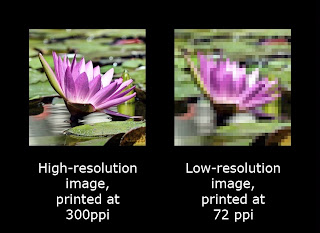
High Resolution VS Low Resolution
High Resolution is typically considered anything higher than 300 DPI. Low Resolution is usually 72 DPI.
Monday, February 6, 2012
Helpful Tutorial
http://tv.adobe.com/watch/adobe-beginner-classes-with-dennis-radeke/episode-16-fun-with-layer-styles/
This is a link to a really helpful tutorial. I was having a hard time with Layer Styles and this video showed me some really fun and creative options!
This is a link to a really helpful tutorial. I was having a hard time with Layer Styles and this video showed me some really fun and creative options!
Monday, January 30, 2012
Monday, January 23, 2012
This is a lossy .jpg file with simplicity as the photo composition. Clearly the smiling pup is the subject of the image. It is also a good example of the rule of thirds.
This is a lossless .png file with a good example of leading lines. The natural lines on the zebra are leading lines as well as the less bold lines of the fence.
This is a lossless .gif file. As you can see the couple is framed really well in the gazebo type structure.
This is a lossless .png file with a good example of leading lines. The natural lines on the zebra are leading lines as well as the less bold lines of the fence.
This is a lossless .gif file. As you can see the couple is framed really well in the gazebo type structure.
Thursday, January 19, 2012
Bad Example
I chose this image for a bad example because it doesn't seem to have a good use of balance. There is also a lot of empty space.
Good Example
I chose this image because I think it has good horizontal balance and because perfume bottle is very dominant in this image.
Subscribe to:
Posts (Atom)


